Dark Circle Font: A Bold Blackletter for Digital Design
I recently had the chance to test Dark Circle, a bold and distinct blackletter font, in a real web design project. The task? Updating the visual identity of a boutique online store that sells handcrafted leather goods. I needed a typeface that would convey a sense of craftsmanship, heritage, and strong character—something that could stand out without overwhelming the user experience. That’s when I pulled up Dark Circle.
First Impressions and Visual Character
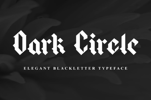
Blackletter fonts have always carried a certain gravitas, and Dark Circle is no exception. It has that classic, almost gothic feel with sharp serifs and deep contrast between thick and thin strokes. What sets it apart from more traditional blackletters is its slightly modernized structure—it feels less rigid and more approachable. This subtle evolution makes it perfect for digital use where legibility on screens still matters.
I immediately noticed how it commands attention in headers. On a hero section featuring an image of a leather-bound journal against a warm wood backdrop, the headline “Handcrafted with Purpose” in Dark Circle felt both elegant and impactful. The weight of the letters gave it presence, while the alternates added just enough personality to keep things visually interesting without being over the top.
Using Dark Circle in Responsive Layouts
One of the first things I checked was how Dark Circle behaves at different screen sizes. I’m always wary of decorative fonts in mobile layouts because they can become illegible or too heavy. But here, Dark Circle held up surprisingly well. Its high contrast and clear stroke separation made it readable even at smaller sizes—though I wouldn’t recommend using it in navigation menus or form labels.
In the landing page layout I worked on, I used it for the main headline and secondary section titles. The key was pairing it with a clean sans serif like Inter or Lato for body copy. This combination allowed me to maintain a strong visual hierarchy while keeping the overall site easy to navigate and digest. The contrast between Dark Circle and a minimalist body font helped guide users through the content without causing eye strain.
Readability Tips for Web Use
- Use for display text: Hero headlines, section titles, and call-to-action buttons work best.
- Pair carefully: Match with a simple, neutral sans serif for body text to avoid visual fatigue.
- Consider background contrast: Dark Circle looks stunning on light backgrounds but needs extra spacing if placed over images or dark themes.
- Test on mobile: Ensure letterforms don’t get lost in small resolutions by adjusting line height and letter spacing.
Brand Identity and Emotional Impact
The boutique I was working with wanted their brand to feel artisanal yet professional. Dark Circle helped them achieve that balance. It brought a sense of tradition and authenticity to their product names and taglines, which aligned perfectly with their handmade aesthetic. At the same time, it didn’t make the site look outdated or inaccessible.
What impressed me most was how the font contributed to the emotional tone of the website. When paired with natural textures and earthy tones, it evoked a feeling of warmth and intentionality. Users scrolling through the homepage got the impression that each item wasn’t just sold—it was curated.
When Not to Use Dark Circle
While Dark Circle is a powerful tool in your typography arsenal, it’s not a one-size-fits-all solution. I quickly realized it’s not ideal for long paragraphs or dense information blocks. For instance, when I tried applying it to a product description block, the text became hard to scan and read quickly. Similarly, it doesn’t perform well in tiny navigation bars or dropdown menus where clarity is essential.
If you’re building a SaaS dashboard or a data-heavy interface, this isn’t the font for you. It shines brightest when used as a statement typeface—think logos, banners, featured quotes, or promotional headings. In these roles, it adds a layer of sophistication and memorability to your brand.
Font Pairing Suggestions
For those who want to experiment with font pairing, here are a few combinations that worked well in my project:
- Dark Circle + Inter: Modern and timeless. Great for editorial-style blogs or portfolio sites.
- Dark Circle + Georgia: Adds a touch of vintage charm. Ideal for niche brands or storytelling-driven websites.
- Dark Circle + Bebas Neue: For a bolder, more dynamic look. Works especially well in campaign pages or course landing sites.
Always ensure there’s enough contrast between the two fonts so the pairing supports rather than clashes with your message.
Technical Considerations and Licensing
Before jumping into any client project or personal website, it’s crucial to check what styles and features come with the font. Dark Circle includes several alternates and ligatures, which can be great for adding visual interest to headlines or branded elements. If you plan to offer digital templates or printables, confirm that the font license allows for commercial use, including embedding in PDFs or SVGs.
I also recommend verifying multilingual support if your audience spans beyond English-speaking regions. While many blackletter fonts fall short in international coverage, Dark Circle does a decent job supporting common European languages, making it versatile for global branding efforts.
Performance and Loading Times
As a web designer, performance is a big concern. Fortunately, Dark Circle is optimized for web use. I tested it on a landing page with minimal other assets and saw no significant increase in load time. It’s a relatively compact file, which is a huge plus when it comes to SEO and user retention.
I also found that it renders well across browsers and devices. There were no unexpected issues with kerning or glyph alignment. The font seems to be designed with responsiveness in mind, which is rare for such a decorative style.
Design Applications I’ve Tried
Here are some specific places where I’ve successfully integrated Dark Circle into digital projects:
- Boutique shop headers: Used in a luxury candle brand’s homepage banner for a dramatic effect.
- Course sales pages: Applied to title sections and feature highlights for a creative writing course launch.
- Portfolio site logos: Combined with a softer script font for a balanced yet bold logo treatment.
- Social media graphics: Featured in Instagram posts and email newsletters to reinforce brand consistency.
- Campaign landing pages: Used in large-scale event promotions for a memorable visual punch.
Each application required a slightly different approach, but Dark Circle adapted well to the variations in layout and context. It’s clear that this font is built for versatility in digital spaces.
Aesthetic Versus Accessibility
Decorative fonts like Dark Circle can sometimes sacrifice readability for style. However, I found that as long as it’s used in larger sizes and with proper spacing, it remains accessible. I avoided using it in small buttons or links, but for display purposes, it’s safe and effective.
WCAG guidelines suggest a minimum contrast ratio for text visibility. Since Dark Circle is a bold blackletter, I leaned into darker weights and lighter text colors when necessary to ensure it passed accessibility standards. Tools like WebAIM’s Contrast Checker came in handy during this phase.
Final Thoughts (Without the Label)
After testing Dark Circle across multiple digital environments, I can confidently say it’s a standout blackletter font for designers looking to add depth and character to their online projects. Whether you're crafting a unique brand identity or simply need a premium typeface for a creative portfolio, Dark Circle delivers both visual appeal and functional strength.
Just remember: use it wisely. Let it speak where it needs to command attention, and step back where simplicity takes over. With the right pairings and thoughtful implementation, it can become a defining element of your digital design toolkit.